

This is my second interview with biologist Dr. Hervé Seligmann.
He has held academic positions at Aix-Marseille University, University of Oslo, Louisiana State University, the University of Chicago, and the Hebrew University of Jerusalem.
Strong Positive Correlations between Teenage Vaccination Rates and Increased Death Rates in Adult Females
About a year ago, Seligmann discovered the University of Washington’s Global Health Data Exchange (GHDx). This database, maintained by the University’s Institute for Health Metrics and Evaluation (IHME), contains the world’s most comprehensive health and demographic data from 1980 to the present.
Seligmann said: “For around 200 countries and around 200 or more diseases, they give you the death rates and the yearly incidences of all of these diseases for each country and also by sex and by age classes.”
Non-commercial users can use the database for free and download search results as CSV files.
Source: https://ghdx.healthdata.org/
When Seligmann discovered this rich data depository in early spring 2025, data were available only until 2021. He found that strange but was nonetheless happy to have at least data for 2020 and 2021.
He downloaded the death rates for 2020 and 2021 from 26 countries for about 60 types of diseases - cancers as well as cardiovascular, neurological and gastroenterological diseases - and he also downloaded the injection rates cumulated over the previous month up to mid 2021 for each of the age classes provided. Then he checked for correlations and found strong positive ones between teenage vaccination rates, in particular for ages 10 to 14, and increased death rates from almost all cancer and disease types in adult females - with virtually no such correlation in adult males.
During our interview, he discusses these findings using the graph below which shows relative excess mortality for adult women in 2021 compared to 2020:
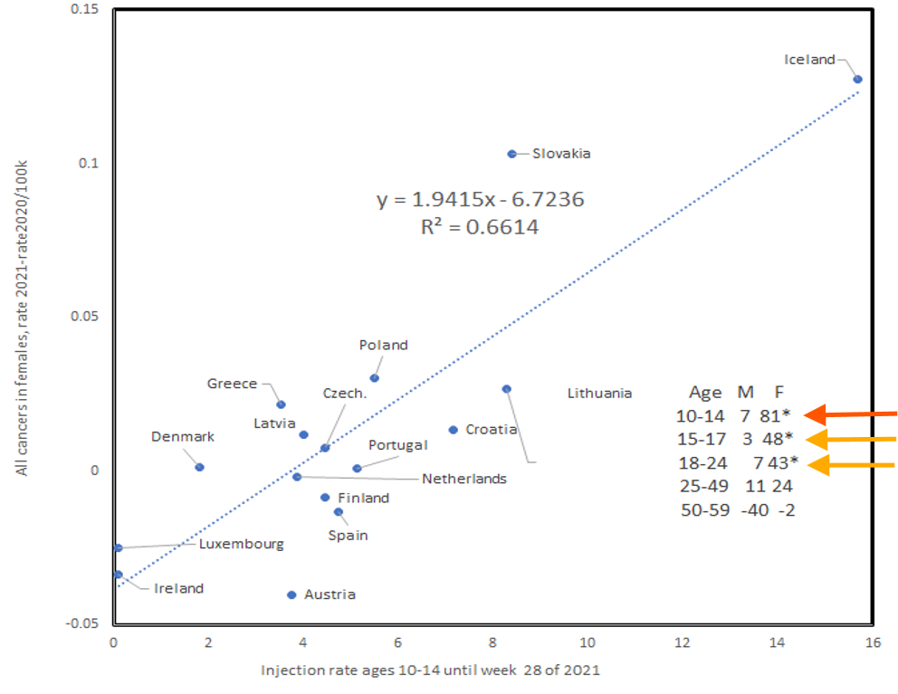
The x axis shows the percentage of 10 to 14 year old injected teenagers and the y axis shows the relative change between 2020 and 2021 in adult female mortality from all cancer types.
“What you see is the more children 10 to 14 were injected, the more women died of cancers overall in that year compared to the previous year.”
And, Seligmann said, it’s mainly women above the age of 50 who were affected.
The little table in the right bottom corner of the graph above shows that this strong correlation decreases the older the injected teens are. For older age groups, the correlation disappears altogether:
The numbers shown for males and females per age group are 100 times the correlation coefficient, Seligmann explained: “The correlation coefficient tells you how good the line that you see in that graph explains the dots, the real data. So it’s how good this linear model is. If it is one or 100 here, it means it’s perfect.”
As you can see, with injected 10 to 14 year olds, the correlation coefficient is 81 for adult females - a strong correlation.
He also found that this correlation was qualitatively significant for 29 out of the 32 cancer types provided in the database: “Almost all cancers in females reacted the way you are seeing on this graph.”
And not only cancers. The death rates among adult females from neurological, cardiovascular and gastroenterological diseases show the same increase: “In almost all diseases, the death rates in females but not in males increase proportionally to that injection rate in mid 2021 of the 10 to 14 years old.”
For adult males, the table shows no correlations between injected teenagers and increased mortality rates from cancers:
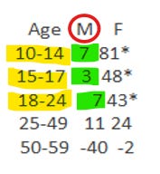
Seligmann: “If it’s zero, it means the data do not fit the linear model. So for males whether we look at injection rates of young teens, 15 to 17, 18 to 24, and so on, you have basically no correlations, seven, three, seven, eleven, and even minus 40, so no correlation.”
Why the Sex and Age Specific Effect in Excess Mortality?
The correlations suggest that teen injections, in particular in 10 to 14 year olds, cause an increase in deaths from cancers and other diseases in older females only.
This finding is surprising. First, why doesn’t the mortality of adult males increase? Second, why doesn’t the mortality of children increase?
Third, why is it in particular older women, over age 50, who experience an increase in mortality from almost all 60 diseases? And fourth, why does the strongest correlation with increased death rates in adult women exist with injected 10 to 14 year olds?
Seligmann believes that the finding presents strong evidence for shedding: “It’s not the children who died from these diseases. It’s women, mainly above 50. So it means teen injections cause deaths from these diseases when you’re older. That almost certainly has to be shedding.”
But Why Would Shedding Affect Adult Women, not Adult Men?
If it’s shedding, shouldn’t everyone be affected equally?
No, says Seligmann, not necessarily. His hypothesis to explain the sex-specific effect is that injected teenagers exude spike protein via breath, sweat and pheromonal pathways and that only adult women, especially those above 50, are uniquely primed to receive it - potentially due to pheromone receptor differences.
“Vaccine shedding exudes from the teens and somehow affects specifically the women, which is why I suspect that the mechanism in which this is happening is related to some pheromonal receptor and maybe also exudation because you have only one sex that reacts… And then the other reason is [that] the young teens might be those who have the most pheromones or that type of pheromones. That’s what I think. I do not think that this is because males are less in contact with teens.”
Pheromones are so-called ectohormones. Instead of being released into your bloodstream, they are released into the environment and act on other individuals. They are secreted through the skin and detected by pheromone receptors even at tiny concentrations and over considerable distances.
Correlation between LNP Concentrations in Mouse Organs and Organ-Specific Cancer Death Increases in Adult Women in 2021
Seligmann also looked into organ-specific cancer death increases for adult women in 2021 to find out if organs that were known to accumulate high concentrations of lipid nanoparticles from the injections were affected by higher rates of cancer.
Pre-rollout, Pfizer/BioNTech had studied the concentration of lipid nanoparticles in mouse organs up to 48 hours after injection and published an internal mouse biodistribution report in late November 2020 - only two weeks before the FDA granted Emergency Use Authorization to Pfizer’s Covid-19 mRNA injection.
This internal Pfizer study, called R-20-0072, concluded that LNPs concentrate in mouse organs to widely varying degrees. The liver and ovaries, for example, accumulate much more of the LNPs after 48 hours than other organs.1
And indeed: Seligmann found a correlation between high accumulation organs and an increase in cancer of those organs in 2021 for adult women. Men, as stated above, were not affected and their cancer rates even showed relative decreases between 2020 and 2021 - with the exception of the liver.
The orange dots in the graph below are females, the blue dots are males.
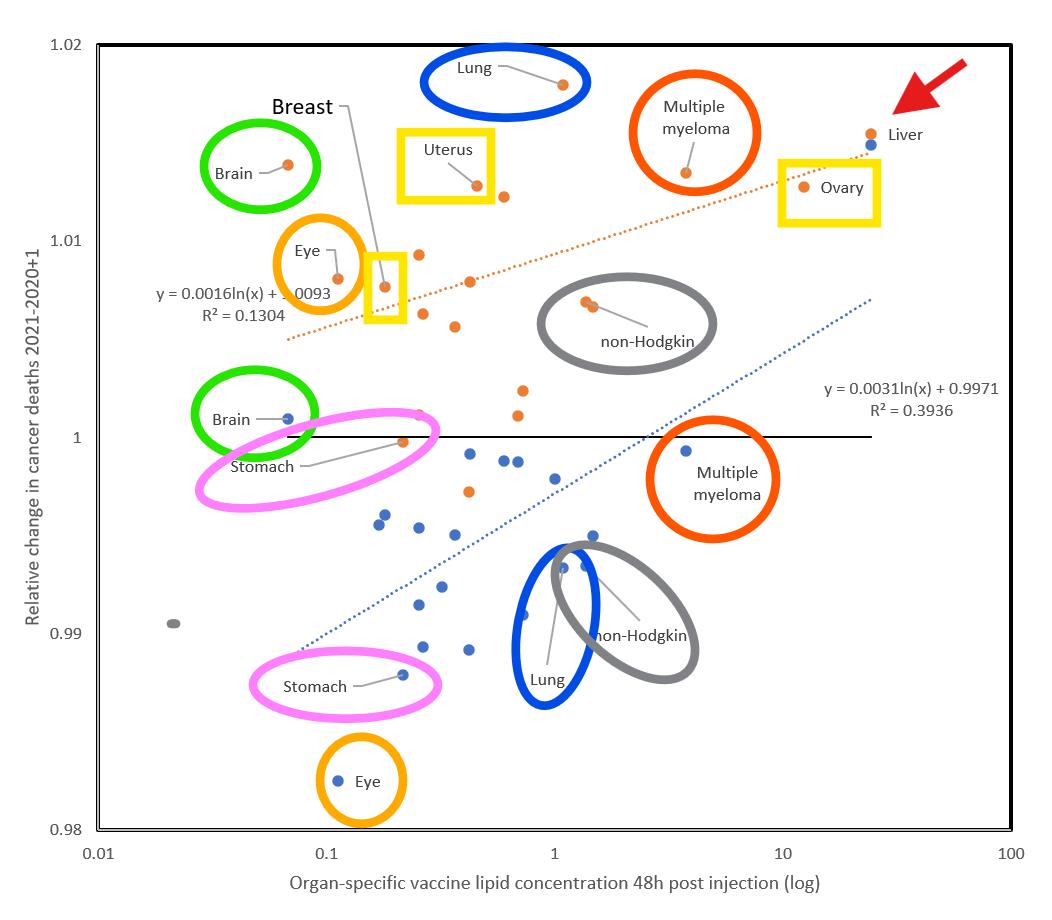
The x-axis shows the organ-specific vaccine lipid concentration 48 hours post injection.
The y-axis shows the relative change in cancer deaths from 2020 to 2021.
The increase in cancer deaths for adult women in 2021, as stated before, is likely the result of teenage shedding.
Males are not affected and even show a decrease in cancer rates from 2020 to 2021. But, Seligmann says, the important thing is to not only look at the absolute value, which is an increase or decrease. You also have to look at the proportionality of the decrease: “And even within those organs who decrease, those who decrease least are those organs who got more of the vaccine.”
The liver, for example, with the highest concentration of LNPs, shows increased cancer rates in 2021 even for adult males.
Retroactive Changes to 2021 Data Erase the Correlations
Back in early spring 2025 when Seligmann discovered the GHDx database, data were only available until 2021 - a fact he found strange. He kept checking the database every month or two to see if data for 2022 and 2023 had finally been published.
At last, in October 2025, data for 2022 and 2023 suddenly appeared. But before he downloaded the new data, he decided to re-check the data for 2020 and 2021 to make sure they were the same as six months earlier in spring 2025 when he had discovered the Global Health Data Exchange.
The GHDx Data for 2020/2021 Were Altered Between Spring and Fall of 2025
He discovered that in October 2025 the data for 2020 and 2021 were not the same as in spring 2025:
“I see the data have changed by plus minus five, on average 5%... So I repeat the same analysis but with the data as downloaded in autumn 2025, not in spring 2025, for the years 2020 and 2021. It’s the same years, the data are for the same years, 2020 and 2021, but downloaded a bit more than six months later.”
This is what he found: The 2020 and 2021 death rates from cancers and other diseases in males and females had been changed in such a way that the correlations between teen injections and adult female death rates had disappeared.
On Seligmann’s graph below you see the difference between the 2020/2021 data, downloaded in spring 2025, compared with the 2020/2021 data, downloaded in the fall of 2025. The blue dots are data from the spring download, the orange dots from the fall download. Note that the graph’s scale is different from the first graph since Seligmann multiplied the results by a thousand.
As you can see, the correlations have disappeared for the orange dots.
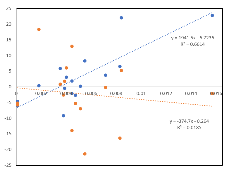
Blue dots: 2020/2021 data downloaded in spring 2025
Orange dots: 2020/2021 data downloaded in fall 2025
Why Did the Data for 2020 and 2021 Change an Entire 5 and 4 Years Later - Erasing the Correlations?
Seligmann told me: “I cannot explain it. There is absolutely no reason that data for 2020 and 2021 as they stood in early 2025 change in late 2025. If you would go to ask the people who curate that site, they will find some kind of excuse, I’m certain… To get the answer, you will have to fight for it, probably in court and it’s costly. And in the end, they will tell you, yeah, we updated the population sizes… Anyways, everything is false, right? I mean, you can try to understand what they had in mind while doing whatever they did. But studying a crime, that’s not my job. I’m not a cop or a lawyer.”
What the Recently Released GHDx Data for 2022 and 2023 Show
Seligmann’s analysis of the newly available 2022/2023 data shows that the shedding signal fades. Instead, long-term direct injection effects appear which affect adult males over fifty nearly as often as adult females over 50.
He concludes that the indirect effect on mortality rates via shedding lasts only for a relatively short amount of time: “In 2023 we barely have any shedding effect, meaning teens injected in 2021 don’t affect death rates in 2023. In 2022 it’s intermediate: you still have a few shedding correlations but much more of a direct injection effect and in 2023 it’s even more.”
In other words, adults, particularly those older than 50, who were injected in 2021 die one or two years later from the injections, not from shedding. And he now finds positive correlations for only about 40% of the 60 disease types for both males and females.
Another remarkable finding from the 2022 and 2023 data is that the injections apparently prime people’s immune system to overreact to shed spike protein years later - similar to an allergic response.
Hiding the Crime
“Reality,” Seligmann said, “is not simple. To refuse to look at reality because it’s complex, that’s refusing reality… Whether it’s shedding or people’s own injections or a combination of the two, which is what I suspect most…. Okay, it’s complex, but that’s how it is and that’s how they hide the crime.”
CHAPTERS
0:00:04 – Intro and Herve Seligmann’s background
0:02:30 – Using GHDx global health data
0:07:59 – Teen injections vs spike in female cancer deaths (2021)
0:11:30 – Interpreting the female-only signal and shedding hypothesis
0:22:30 – Data for 2020–2021 changes between spring and autumn 2025
0:27:35 – Can these updated datasets still be trusted?
0:39:56 – 2022–2023: shifting from shedding to direct injection effects
0:45:22 – “Priming” idea: injections heighten response to later shedding
0:51:31 – Ongoing boosters in older people vs dropping uptake in teens
1:07:26 – Organ-specific cancer deaths vs Pfizer biodistribution data
1:19:40 – Summary: vaccines as main driver, mechanisms remain complex

